O’Charley’s Restaurant Branding
THE PROBLEM
We were asked by Nashville-based O’Charley’s restaurants to come up with a strategy to help them stand out in the crowded market of casual dining restaurants. Many restaurants had grown to have a similar tone in terms of their branding and messaging and we agreed that differentiation was paramount to O’Charley’s success. Also, O’Charley’s personality felt disjointed. They didn’t really have a consistent “vibe” between the in-store experience, social, and marketing materials.
THE INSIGHT
While there might be some temptation to lean into the Irish sounding name, O’Charley’s definitely wasn’t an Irish pub, so any association there would be muddy their personality. We wanted teh new look to make a promise we could definitely keep. O’Charley’s was based in Nashville so I stated thinking about my experience with that city. I had been there often for shows, even played a couple, and I even recorded an album there. I recognized a unique parallel between a great restaurant experience and a great live music performance. They’re both all about celebrating the live, in-person experience of gathering with friends, having a great time out, breaking bread and sharing drinks with loved ones, retelling the stories of our lives, and creating new stories along the way.
Better yet, I realized they have a shared vocabulary as well. There is a big crossover between things you might hear at a dinner out and things you might hear at a live concert. They translated well as headlines.
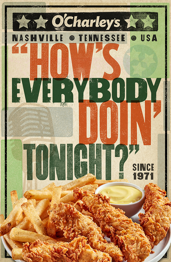
“How’s everybody doin’ tonight?”
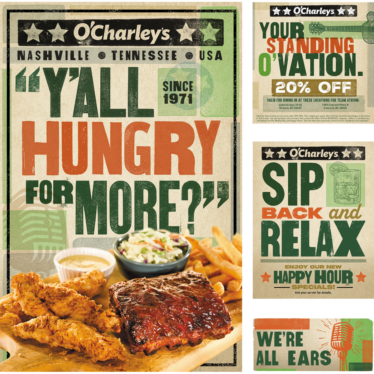
“Y’all hungry for more?”
“You’re in for a real treat!”
“Thank you so much for coming out!”
“We’ve cooked up something special for you.”
“We’ll see you next time!”
THE SOLUTION
So we took O’Charley’s back to their Nashville roots.
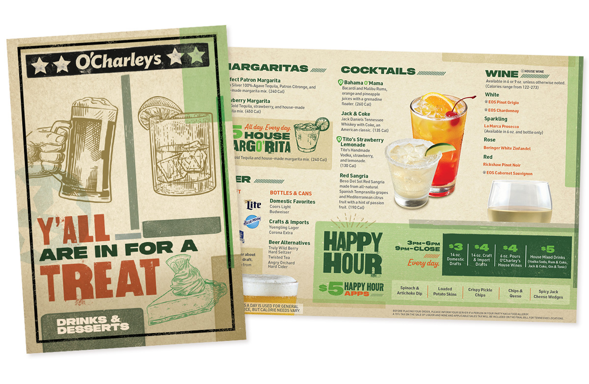
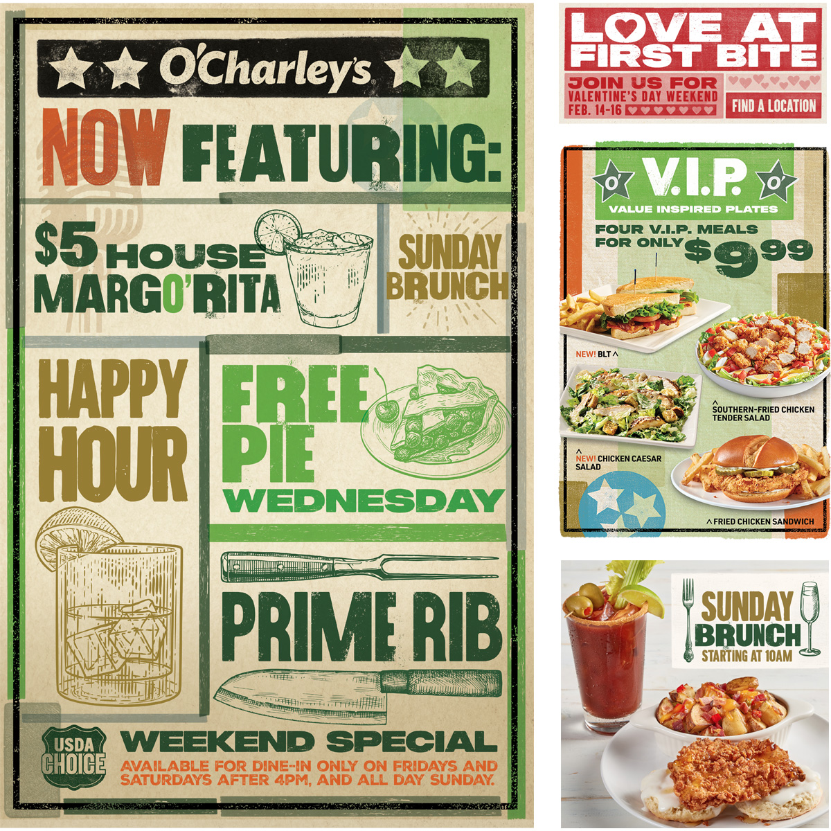
Visually, I found inspiration in the look of classic letterpress gig posters. They’ve been a staple of the scene since the days of Elvis and Johnny Cash, but are still very much in demand today. Visually, the posters are a way to say “Nashville” or “The South” without using cliché imagery of instruments, honky tonks, or cowboy boots. The genuine hand-crafted, ink-on-paper look of the print pieces also suggest the personal care that goes into the preparation of every O’Charley’s meal and their attention to personal customer service.
It culminated in an all-new comprehensive brand book with our signature look.
THE RESULT
The reviews have put us at the top of the charts. Our clients at O’Charley’s and their customers agree that we’ve given O’Charley’s a fresh, genuine, unique personality and look that reflects their roots.
The best benefit was the brand became easier to understand and easier to use. Teams could produce work more consistently, materials felt more cohesive, and the overall experience became more recognizable across touchpoints. What had been a collection of disconnected pieces started to feel like a single, unified brand again—all with a little Southern twang.
Click the three dots to view full screen.